
Palette

Empowering inclusivity: An innovative app making makeup shopping accessible for those with color blindness.
Overview
This is my submission to the 2023 ELC Hack4Ally Hackathon. The challenge was to ideate or develop an inclusive technology solution that enhances accessibility in the beauty industry and/or a consumer's beauty experience.
Problem
There are an estimated 300 million people who have some form of colorblindness. Shopping for makeup becomes difficult when arbitrary names are used to name colors, such as "Midnight Dusk". How might we help those with colorblindness confidently and accurately choose and pair makeup colors?
Solution
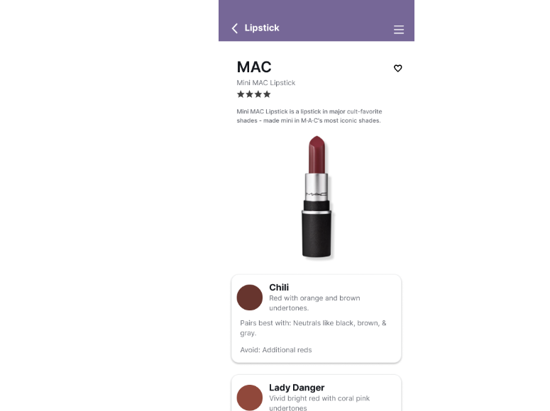
Ideate an app that helps users find makeup items by guiding the user to "see" the colors around them. Users can search the database for beauty products that then describe non-arbitrary colors (ie. "Midnight Dusk" is labeled as Dark Grey). It also allows users to point their phone camera at items and tell the user which non-arbitrary color it is pointing at.
My Role
UX Designer
Responsibilities
Conducting interviews, creating personas and user journey maps, competitive audit, wireframing, mockups, prototyping, usability studies, iterating on designs
My video submission to the Hack4Ally challenge
Timeframe
February 7 - March 19, 2023
Interviews & Surveys
After reading the judging criteria and rules, I outlined my research strategy and objectives. Defining and understanding the target audience and their challenges was my priority. First, I surveyed anyone who considered themselves to have a disability and who also shopped for beauty products. I also remotely interviewed 3 participants from those surveys. I narrowed the challenges down to 3 disabilities: severe allergies, low hand dexterity/grip, and colorblindness. Due to a personal connection to the issue, I decided to focus on colorblindness and discovered 3 main pain points in my further research (listed below).
Arbitrary color names are often used in beauty products
Fear and embarrassment when choosing or applying makeup
Desire to connect with others who experience colorblindness

Sketching
I began the design process with low-fidelity sketches and wireframes to accelerate decision-making through visualization without losing time. My sketches were based on the initial user interviews and secondary research. I wanted to address the pain points and brainstorm as many possible ideas:
Arbitrary colors - How can I help colorblind users "see" what color makeup they are using?
Fear/Embarrassment - How can I give colorblind users the confidence to choose and apply makeup?
Connection - How can I help create a friendly and positive environment for everyone?

Wireframes
Using my sketches, I mapped out several low-fidelity wireframes. Based on the pain points, I wireframed for the following solutions:
Arbitrary colors - I framed out a database of makeup products that properly defines colors in their most basic sense (ie, "Midnight Dusk" becomes Dark Grey). I also framed out a scan feature that uses the user’s phone camera to better define color.
Fear/Embarrassment - I included tutorials where relevant, and listed colors to pair or avoid with each selection.
Connection - Although I did not frame this one out yet, I wanted to include an icon on the navigation bar that would lead to a community of support from other users.

Prototype
Using Figma, I began to piece together user flows from my sketches and wireframes. I decided to use a high-fidelity prototype to gain better feedback from users on accessibility concerns with color.
Accessibility Considerations
Given that this was a Hackathon submission that addresses accessibility, I wanted to make that one of my top priorities.
I used a colorblindness simulator to ensure that the colors I used on the UI were clear and legible.
I used a WCAG (Web Content Accessibility Guidelines) checker to ensure that the contrast in background and wording was at an acceptable standard.
I made sure that color was not the only conveyor of message. For example, an error message usually shows up as red but I used icons and words to also convey when an error has been made.


What a typical non-colorblind person sees


Different variations of what a colorblind person may see

Usability Testing
Using the Figma prototype, I performed 3 unmoderated usability tests. The main issues I defined were:
Issue 01 - The scanner doesn't function
I received a lot of positive feedback about the potential of the scanner feature. Users were disappointed that a proper prototype wasn't available.
Issue 02 - The navigation bar was confusing
There is no indication on the navigation bar of where the user is. For example, if the user was under their "Favorites" section, nothing on the bar was highlighted to show the user that's where they are. I will iterate on the design by highlighting where the user is at.
“This app is everything I’ve been hopeful for as a young colorblind woman! It gives me peace of mind knowing that descriptions, tutorials, examples, and videos are all at my fingertips allowing me the same opportunity as those with normal color vision to feel confident and beautiful”
Next Steps
Because this was a submission to the ELC Hack4Ally hackathon contest, I was on a very limited budget and timeline. I would love to take the ideation of this app into actual reality. My next steps would include:
01
Iterate on the design based on usability testing feedback.
02
Meet with the ELC team to move this project from an idea to a real functioning app
03
Wireframe and prototype all sections and features of the app
Learnings
With this project, I learned how important accessibility is. Embracing accessibility has led me to challenge my normal, everyday thinking and lean towards creating amazing products that are inclusive to ALL users. When you design for accessibility, you remove barriers that benefit both those who have disabilities and those who do not. I believe that this app not only benefits colorblind users but would be helpful for those without colorblindness when it comes to finding and pairing makeup.
“When UX doesn’t consider ALL users, shouldn’t it be known as “SOME User Experience” or… SUX?”
Thank you for reading my case study.
Check out one of my other projects below!